Today vs. 2012; Different This Time For Gold

Gold bugs will remember 2012 as the last year of hope that gold was still in its bull cycle as it managed to hold key support around 1550 into year-end. It should not be lost on us that here into year-end 2019 gold’s new bull cycle has risen to, and logically halted at, the very same former support that is now important resistance to a new bull market.

We anticipated this resistance in the summer, and although the up-turning Semi cycle of 2013 was logical to gold’s demise 7 years ago, that is no longer the case as Semiconductor leadership takes a new leg up in 2019. Why? Well, let’s explore just a few of the differences between then and now.

gold

Difference #1: The Yield Curve

The post-crisis era into 2012 was “inflation all the way baby!” as so well stated by my friend, the late Jonathan Auerbach back in Q4 2008. It was monetary fire hoses all day every day and policy makers didn’t care who knew it. There was a major systemic meltdown of the previous inflation in play and of course, our heroes at the Fed fought that realized risk with more of what created it in the first place, balls-out inflationary policy.

The crowning achievement – and gold killer – of post-crisis policy was 2011’s Operation Twist and its stated mission of controlling the yield curve, as Twist’s agenda to buy long-term Treasury bonds and sell short-term Treasury bonds was the very essence of a flattener. That cannot be disputed. Bernanke kicked off the great flattening and gold was done for years to come. Continue reading "Today vs. 2012; Different This Time For Gold"

Gold & Silver: Expected Drop Kicked Off

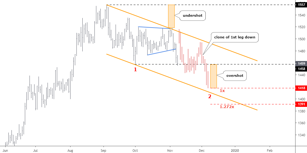
It was a timely call last week to "Beware Of Extended Consolidation" as right from last Monday we saw both metals plummet all the week long. Surely, it wasn't a self-fulfilling prophecy as the market was unexpectedly caught in a bullish euphoria. The chart structure was telling us about this possibility as such patterns appear from time to time. The same pattern had appeared on the Bitcoin chart as I had warned you this past August. That pattern of extended consolidation smashed Bitcoin’s value as planned from $10600 down to the projected target of $7800. Let's see where this pattern could send precious metals prices this time around.

Chart 1. Gold Daily: Undershot => Overshot

gold silver
Chart courtesy of tradingview.com

We've got the tricky junction between two legs down on the gold chart. The triangular structure (blue) had been shaped as lower peaks, and higher valleys were established there. This pattern is rarer than the regular zigzag that I was expecting to unfold. It created a huge undershot to the top of the range, which might result in a big overshot below the bottom of the range. By the way, gold already dropped like a rock to pierce the valley of the range last Friday. But, of course, that's not enough. Continue reading "Gold & Silver: Expected Drop Kicked Off"

Updating The 3 Amigos And The Global Macro Message

This morning in pre-market the Amigos’ futures charts update the macro story…

global macro

…which goes something like this…

Copper, the cyclical Amigo (weekly chart) has furthered the intermediate trend line break we noted on October 25th. This is in line with the rally in US and global stock markets and even more so, the global macro reflation theme. It does not look so impressive yet on this weekly chart, but other components of the macro trade are starting to look impressive, especially on daily charts. So… steady as she goes. Continue reading "Updating The 3 Amigos And The Global Macro Message"

Gold & Silver: Beware Of Extended Consolidation

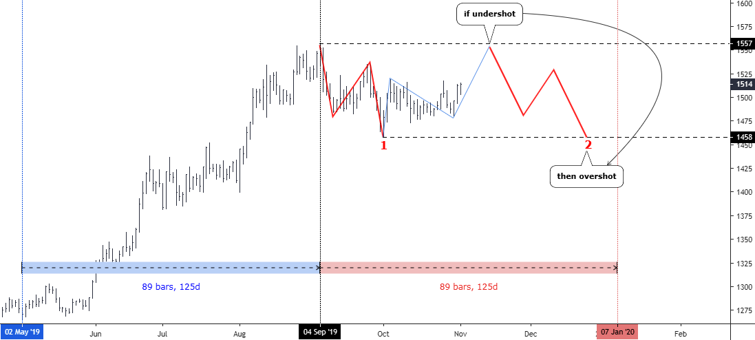
Gold and silver chart structures got synchronized, and I am happy to bring them back together in this post.

Chart 1. Gold Daily: $1557=>$1458

gold silver
Chart courtesy of tradingview.com

In my earlier post, I shared with you a detailed 4-hour chart of gold with a bullish outlook. Fortunately, the price had indeed gone higher and booked $27 per each ounce since then. I set the confirmation above $1520, which wasn't triggered yet, although we were very close as a high was hit at $1518 at the end of October. Continue reading "Gold & Silver: Beware Of Extended Consolidation"

Silver & Gold To Inform Dr. Copper

They call copper the metal with the Ph.D. in Economics. But these days Doctor Copper is little more than a quack in that regard, taking a cue from the metals whose interplay will be critical to deciding the coming macro for 2020 and the run-up to the next US election. Thus, they are the 3 Metallic Amigos, riding together but providing different signals at different times (this being nftrh.com, you will have to put up with the odd shtick from time to time).

Silver Gold Copper

As we have noted repeatedly, the Silver/Gold ratio takes it place alongside other indicators (like long-term Treasury yields, yield curve, TIPs ratios, inflation breakevens, etc.) of a would-be inflationary environment. When silver (more cyclical, commodity-like characteristics) rises vs. gold (more counter-cyclical, liquidity haven characteristics) it is a hint toward an inflationary macro.

A daily chart of silver/gold shows a constructive ratio at yesterday’s close and this morning in pre-market silver is +2.77% while gold is +.77%. The implication could well be an end to the current bull flag consolidation at the moving averages and the next upturn in silver/gold, the miners and possibly the inflation/reflation trades that tend to follow. Continue reading "Silver & Gold To Inform Dr. Copper"