Gold Hits Target And Seven Year High

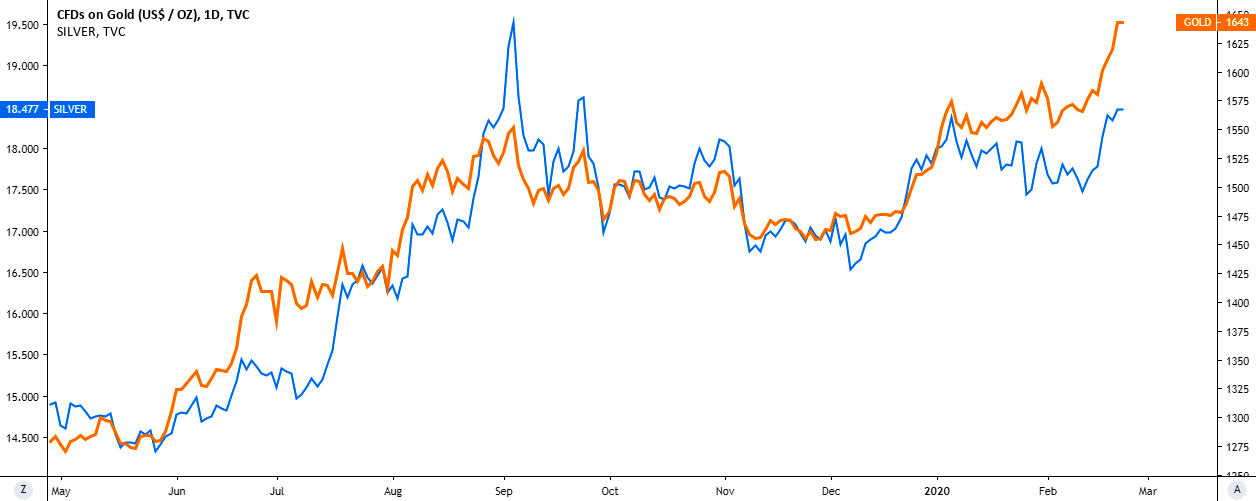
Before we start analyzing gold, let’s see how two precious metals behave in comparison on the chart below.
Gold
Chart courtesy of tradingview.com Gold (orange, right scale), Silver (blue, left scale)

This chart above starts from the bottom area of 2019. The most of the time, the yellow metal leads the game as Silver follows suit showing sharp moves to catch up with the gold. Sometimes the laggard throws over the leading trend amid excessive market reaction to the big moves of the top metal. Such extremes are rare and quickly get normalized by market “whales.” From this perspective, there is nothing new we can find on the chart. Continue reading "Gold Hits Target And Seven Year High"

Crude Oil: Buy Setup With 1:6 Risk/Reward Ratio

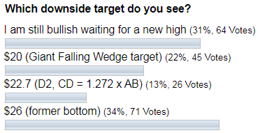
Last time I updated on the crude oil futures in May 2019, I asked if “You Were Waiting for Crude Oil at $20”. Both the weekly chart and the monthly chart had a bearish outlook as the price of crude topped at $66.60 and then it plummeted below $60. The targets were set between $32 and $22. Check out the poll results below.

Crude Oil

Most of you voted that the price would tag the former bottom of $26. As we know now, the price indeed dropped heavily, but it couldn’t break below $50 and bounced back up from there. So the majority result was the closest call, although with a considerable difference.

The chart structure had changed since then and I am happy to share with you the emerging buy setup for crude oil futures with a considerable reward opportunity. Let’s start with an updated weekly chart below to see the idea. Continue reading "Crude Oil: Buy Setup With 1:6 Risk/Reward Ratio"

Visualizing Correlation: Gold Vs. Other Instruments

Some of our regular readers kindly shared their opinion about the gold market correlation with other instruments in the comments section under my previous post. I think it could be interesting for all of us to see what is going on there if we check the correlation between gold and other instruments.

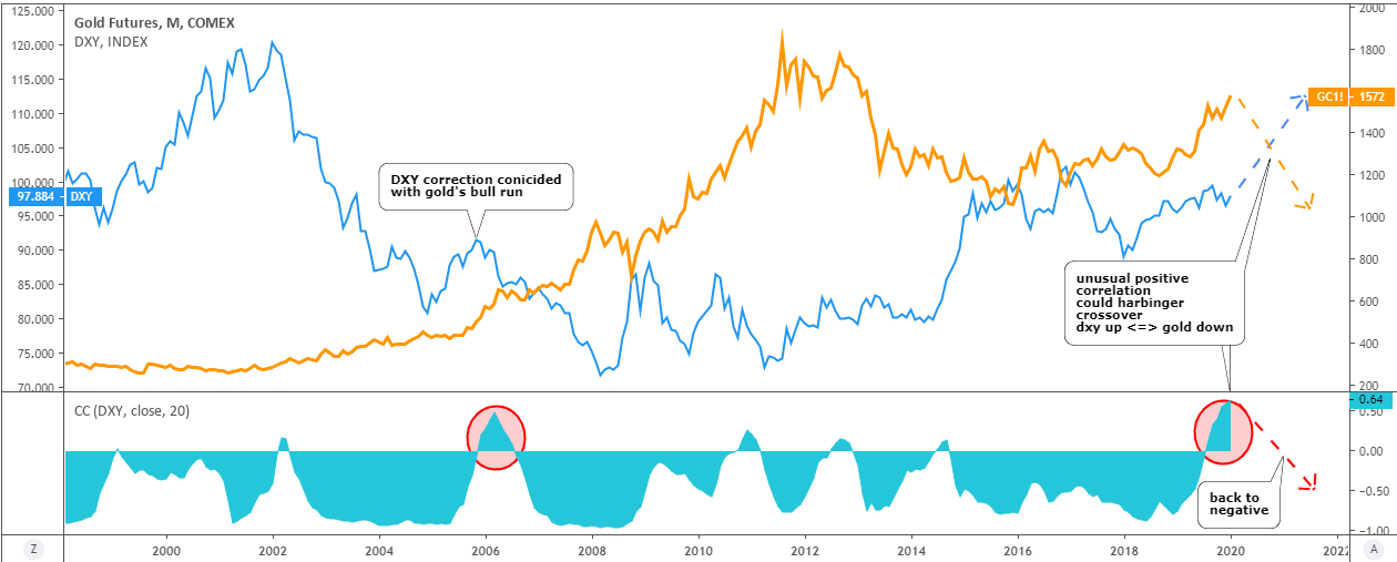
I prepared the visualization of it for you below. The dollar index and the 5-year TIPS (Treasury Inflation-Protected Securities) were named in the comments, and I will add two other top instruments, so please stay tuned.

Let’s start with the Dollar Index (DXY).

Correlation
DXY: blue, left scale / Gold: orange, right scale / Correlation coefficient: turquoise, sub-chart - Chart courtesy of tradingview.com

For more than 20 years, these two instruments were mostly in a negative/mirrored correlation. It just changes from extremely negative to zero correlation with rare spikes into positive territory. Continue reading "Visualizing Correlation: Gold Vs. Other Instruments"

Gold Hits Second Target

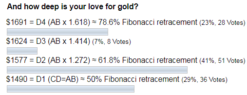
On the 6th of January, gold had hit the second target of $1577 that I showed you last June when we measured the depth of gold bugs love. I will update the big chart for you below to show why this second target is crucial. By the way, this target was the most favored then as you can see in the graph of ballots below.

gold poll

It’s a real miracle that we witnessed the Santa Claus Rally again this year. I updated the short-term chart for gold right ahead of Christmas as I thought the correction would extend itself to delay the rally for a later period. The invalidation point for the bearish scenario was set at $1516 as the price moved almost $100 above that point for someone’s benefit.

gold poll

Most of you voted for the immediate rally as you didn’t expect another drop, and you were amazingly right, again!

I think it’s time to check big charts to adjust our short-term navigation plans. Continue reading "Gold Hits Second Target"

What An Expiring Bubble Looks Like

The Nasdaq bubble popped in 2000 after motoring upward on increasing volume in two separate phases. Volume rammed upward and RSI diverged. Like shootin’ fish in a barrel, it was, except that at the time I was too inexperienced to see it. It was a steep slope and blow out.

compq bubble

The 2006 bubble in copper made a consolidation and a steep slope and blow out of its own with a little help from rising volume, but nothing like the above. No notable divergences here. The inflation trade of the time was starting to rotate, and rotate commodity herds did… Continue reading "What An Expiring Bubble Looks Like"