Dollar Index: The Last Shall Be First

Since my last update, the dollar advanced further to the upside establishing the new multi-year top of $105 in the middle of May. Later, the market started the correction as the dollar index (DX) drifted into the area of $101.

Last time, you bet the most on the further rise of the dollar to $121 (Neckline of Giant Double Bottom pattern). The second choice was the Bearish scenario for the main currency. It is early to judge the results as the price dynamics are somewhat mixed.

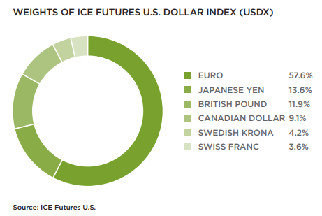
Let me show you one comparison graph that shows the underlying fundamentals of the dollar index. But, before that, to refresh the memory, firstly, I put below the chart showing the composition of the dollar index.

Dollar

The euro takes the largest piece of cake with 57.6%; the Japanese yen with 13.6% is the second largest component, although the gap with the euro is huge. The third is the British pound, as its part weighs 11.9%. Continue reading "Dollar Index: The Last Shall Be First"

Gold Update: Window Of Opportunity Still Open

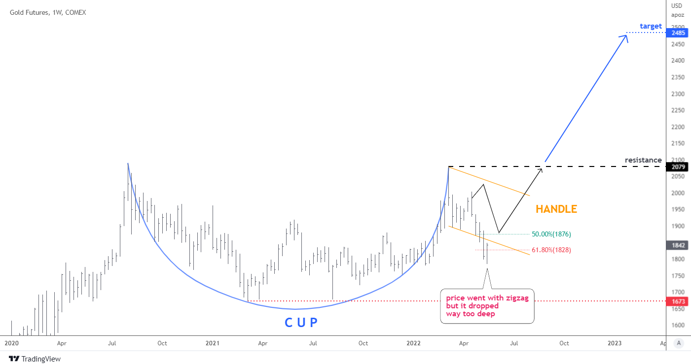
Last month I spotted a “Repeated Bullish pattern” of another Cup & Handle model.

The majority of readers confirmed that they see it either. Most of you supported my outlook of an extended Handle with another zigzag to the downside. This was the right guess. Let me show it to you in an updated chart below.

Weekly Gold Chart

Indeed, the gold futures price followed the black zigzag on the chart to the downside. Hence, the outlook played out as planned. However, the depth of the drop was excessive as it hit below the expected valley of 50% Fibonacci retracement level and even 61.8%. The collapse stopped only close to four-fifths of the Cup. The classic approach would invalidate the pattern in this case. Continue reading "Gold Update: Window Of Opportunity Still Open"

Crypto Apocalypse?

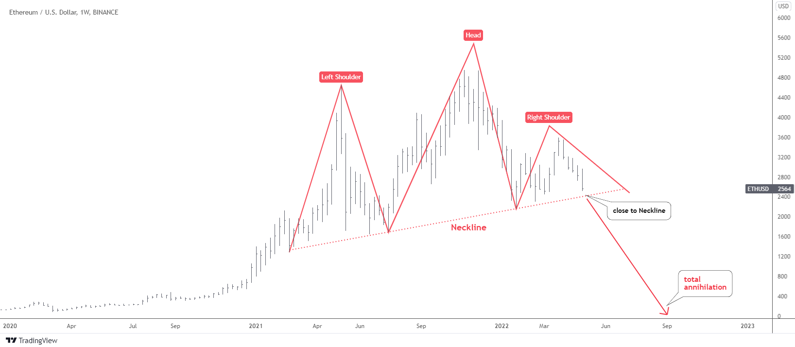
Ethereum (ETHUSDBIT) has an annihilation pattern in its chart and I would like to share it with you below as the price of the second largest crypto is approaching the trigger point.

Crypto - Ethereum Chart

You know this famous pattern very well as this model frequently appears in different instruments. I know it looks a little bit weird as the shoulders are not symmetric. However, all parts are in place, and the Head is the highest peak.

The failure to proceed to the upside after breakout beyond this February’s peak of $3,280 dried the demand for the second largest cryptocurrency; it has been building the small Right Shoulder of the pattern. The Neckline has been drawn through the valleys of the Head. Continue reading "Crypto Apocalypse?"

Dollar Index Hits Your Target And More

Three weeks ago, I shared the chart of the U.S. Dollar Index (DX) with a bullish outlook.

You supported the idea with the most votes given to the conservative target of $103 located at the peak of Y2020. Your winning vote played out last Wednesday, the 27th of April. Kudos to all of you.

It is time to dust off the big chart again to update on further prospects.
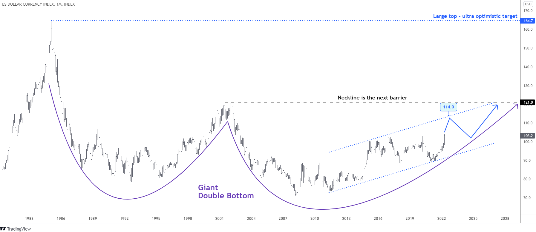
Dollar Monthly Chart

The green triangular scenario has been eliminated as the price surpassed the last year’s peak of $103. The least favored blue path is the primary plan now. I turned the blue arrow into a blue zigzag as the price could take a break after hitting the upside of the blue dotted trend channel around $114.

The next barrier (black) of the Neckline (Giant Double Bottom pattern) is located at $121. It is that very target I was calling for in the title of the previous post.

It is too early to talk about the plan in case the Neckline is broken, although we have no other large barriers beyond, except the all-time high at the peak of the distant 1985 of $164.7. It would be an ultra-optimistic target with the total dominance of the dollar across the globe.

Where do you think the dollar index will stop?

View Results

Loading ... Loading ...

I want to show you one chart below that could shed light on why the dollar could rise further.
Historic Interest Rate Chart

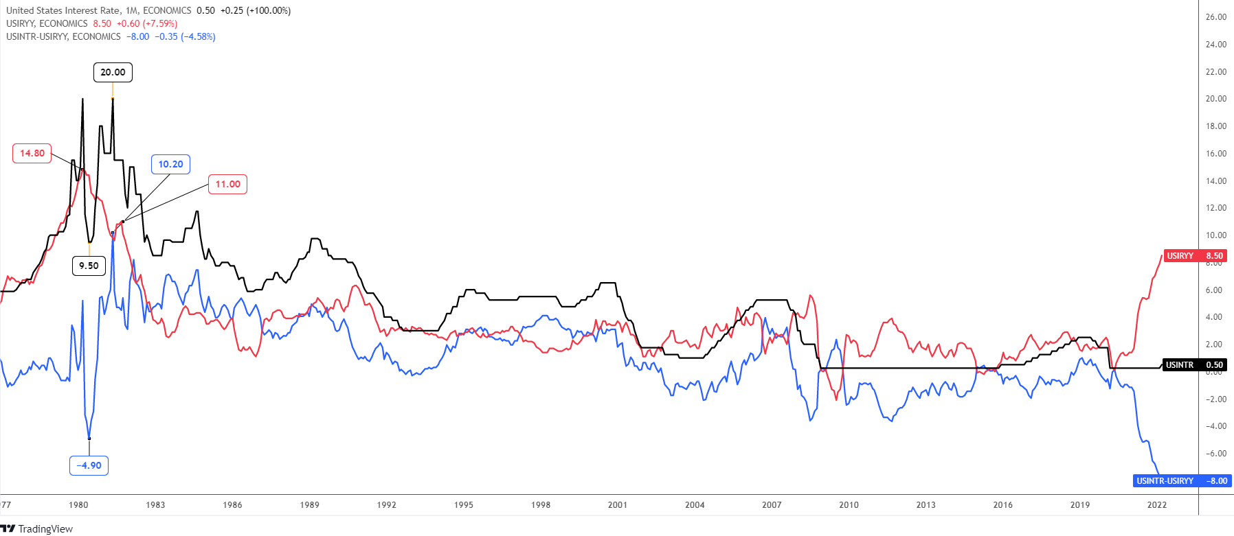
There are three lines in the chart above that represent the U.S. interest rate (black), U.S. inflation rate YoY (red), and the U.S. real interest rate (blue). It starts from 1977, and for the considered period, the current real interest rate has the most negative reading of -8%. Thus, the Fed has been forced to admit that this raging inflation is not transitory, and it should respond appropriately to take the rising prices under control. This week, the market expects a 50 basis point hike from the Fed; this would double the interest rate to 1.00%.

In 1980, the real interest rate had dived deep into a negative area to hit the valley -4.90% amid the strong inflation above 14% and the falling interest rate (9.50%). This triggered the fast-paced tightening of the monetary policy as the Fed rate more than doubled to hit the earlier top of 20% in just one year. The inflation quickly dropped to single-digit numbers under such severe pressure. Indeed, the real interest rate made a V-turn accordingly to match even with the inflation rate of around 10%.

If we take history as a sample, the Fed could take the interest rate much higher beyond the most hawkish expectations. The simple calculation shows that the Fed rate topped at the ratio of 1.35 to the peak inflation rate (20/14.8). Applying this math to the current situation, we should multiply 1.35 by 8.5% of the inflation rate. Then the Fed should hike up to 11.5%, an unbelievable number! Although, it will not update the all-time high.

The time lag between the peaked inflation and the first hike was almost a half year in the past. This time, the Fed took the first step almost immediately if we take the March inflation reading as the peak. It could change the size of the tightening, as the speed really matters.

Do you think the Fed rate could hit 11.5%?

View Results

Loading ... Loading ...

The higher the real interest rate, the more attractive the currency is. The hawkish Fed could spur even stronger demand for the U.S. dollar.

I am eager to see your opinion in the comments below, as it has enriched our view many times before.

Intelligent trades!

Aibek Burabayev
INO.com Contributor, Metals

Disclosure: This contributor has no positions in any stocks mentioned in this article. This article is the opinion of the contributor themselves. The above is a matter of opinion provided for general information purposes only and is not intended as investment advice. This contributor is not receiving compensation (other than from INO.com) for their opinion.

Bitcoin Still Shines Like A Sun

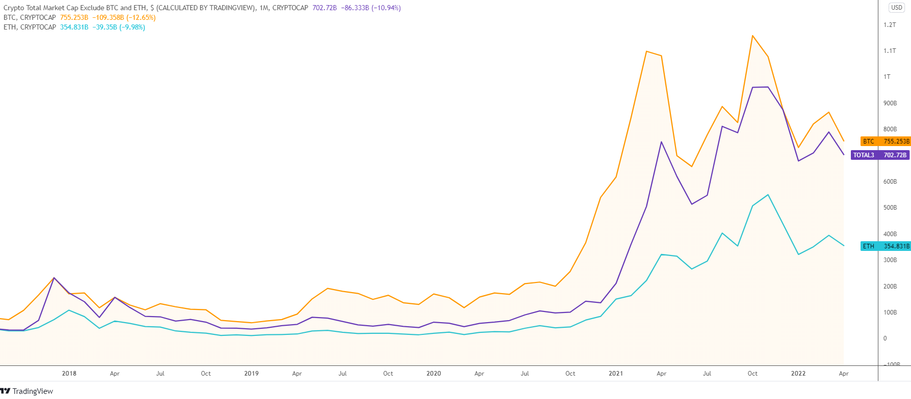
In this post, I would like to show you what happens to the structure of the crypto market over time as new stars join the universe with hopes of taking down the shining star, Bitcoin.

Chart 1. Market Cap Comparison: Bitcoin, Ethereum, and Altcoins

Bitcoin vs. Ethereum

The chart above starts in September of 2017. Both altcoins and Ethereum had a market cap of around $30 billion, while the main coin had more than double that at $72 billion. The latter started to rally at once, reaching the top of $231 billion by the end of 2017. Altcoins followed Bitcoin with a delay of one month; however, the growth was more robust and the market cap caught up with that of the main coin rising more than seven-fold. It was that very rare moment when the market cap of altcoins could touch the “Sun” of Bitcoin in the considered period. Continue reading "Bitcoin Still Shines Like A Sun"