Crypto Update: It Ain't Over Yet

It was a close call this May with a doom-saying title “Crypto Apocalypse?” where I shared with you an annihilating model for Ethereum and a bearish chart of Bitcoin.

Let us see what happened in the crypto market since then in the chart below.

Crypto Total Market Cap

Source: TradingView

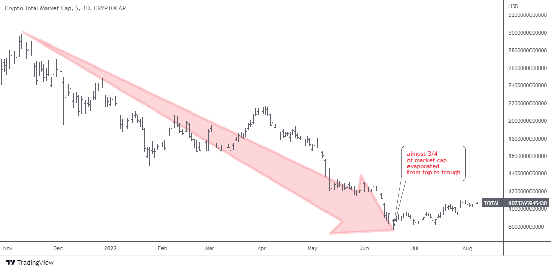
Total crypto market cap had skyrocketed to the maximum of just over $3 trillion last November. Since then, almost ¾ of the total market cap has evaporated on the crypto crash down to $762 billion this June. That hurts!

More than $2 trillion of wealth was destroyed during that collapse. Some people were calling it a “crypto-winter” of the market. All of us have probably noticed that less videos and posts with clickbait titles on “how to become a crypto-millionaire” or new rising stars in the crypto-market have been popping up on social media lately.

In the next market share chart, let's check the status quo of the market leaders.

BTC ETH Dominance

Source: TradingView

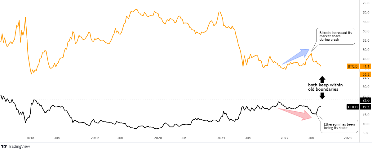
During the collapse of the market, the main coin (orange) has managed to increase its market share tremendously from 40% up to 48% on the peak in June. How could that happen as it was bleeding alongside the whole market? The speed of the drop is the main reason. Continue reading "Crypto Update: It Ain't Over Yet"

S&P 500 Bullish Divergence

Last September, I called the S&P 500 index to lose 30% according to the projection based on a comparative analysis.

The index price was at $4,459 that time. The deepest valley since then was established at $3,637 last month. 18% of the index value evaporated since the idea had been posted and 25% from the top of this January ($4,819).

The majority of you voted for 10%-20% retracement and this was the closest call so far as we cannot be sure whether it is over or not.

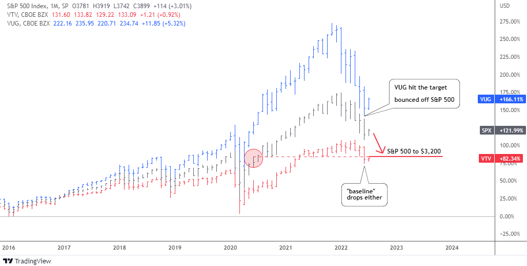
To remind you, I had put together two ETFs and the S&P 500 index (black). I chose Vanguard Value Index Fund ETF (VTV) (red) and Vanguard Growth Index Fund ETF (VUG) (blue). Let us check the updated comparison chart below.

SP500 VTV VUG Comparison Chart

Source: TradingView

The bearish alert appeared to me when the value stocks (VTV, red) stopped contributing to the rise of the broad index. Moreover, the gap between the latter and the growth stocks (VUG, blue) has widened tremendously.

The retracement targets for VUG and the S&P 500 were based on the corresponding level of underlying / less performing instrument: for VUG it was the S&P 500 and for the S&P 500 – VTV.

It is amazing how accurately the VUG target at $217 was hit last month as the ETF dropped even lower in the valley of $213. The concept played out precisely as the VUG bounced off the broad index, blue bars approached but did not overlap black bars.

The S&P 500 index almost closed the gap with the VTV last month, however the VTV itself also dropped and hence wasn’t caught up. The retracement target has been set at $3,200 last September and the lowest level has been seen since then was $3,637 last month.

Let us look at the S&P 500 chart below to see what could happen next.

SP500 Weekly Chart

Source: TradingView

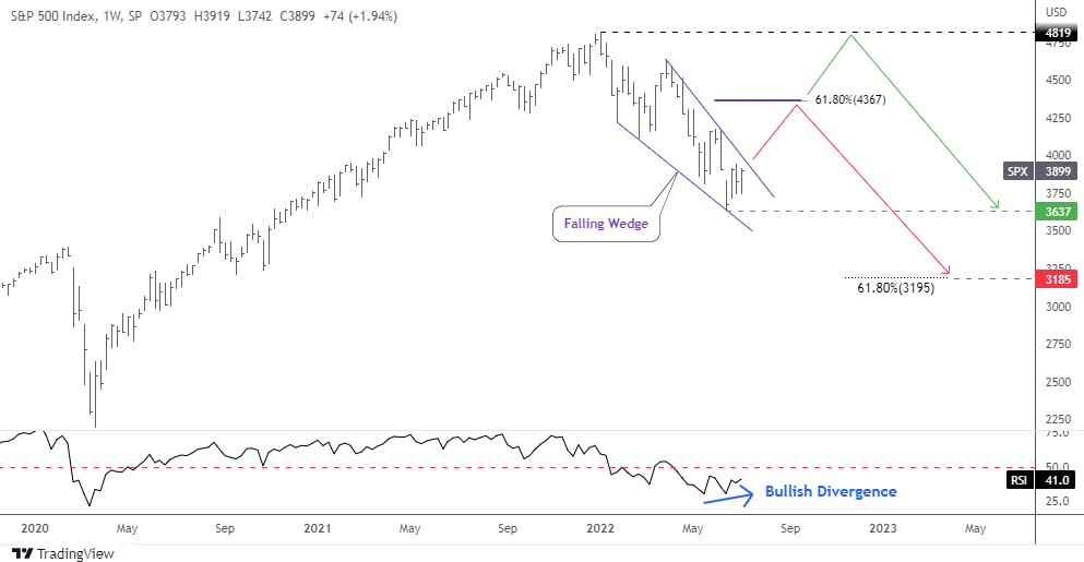
The price has shaped a familiar model of the Falling Wedge (purple) within the current retracement. The amplitude of fluctuations decreases as the price approached the apex of the pattern.

The RSI indicator has already built the invisible Bullish Divergence as it can be seen only through its readings: 30.2 vs. 30.5, which means higher valley versus the lower bottom in the price chart.

This combination of narrowing trendlines and bullish diverging indicator could result in the possible breakup anytime soon. Would it be a reversal or a dead cat bounce?

I added two paths on the chart. The red zigzag shows how the Falling Wedge would play out in the first place. The target (purple flat line) is located at the widest part of the pattern added to the breakup point. It coincides with the 61.8% Fibonacci retracement level at $4,367. It could be a double resistance.

The following drop should complete the complex correction down to $3,185. This target was calculated by subtracting the size of the Falling Wedge from the target of that pattern. And again, this area corresponds amazingly with the 61.8% Fibonacci retracement level and the first chart target based on a comparison with VTV.

The green path implies the sideways consolidation that should keep within the existing range of $3,637-$4,819.

Which way do you think the S&P 500 will go?

View Results

Loading ... Loading ...

Intelligent trades!

Aibek Burabayev
INO.com Contributor

Disclosure: This contributor has no positions in any stocks mentioned in this article. This article is the opinion of the contributor themselves. The above is a matter of opinion provided for general information purposes only and is not intended as investment advice. This contributor is not receiving compensation (other than from INO.com) for their opinion.

Market Distortion: Crude Oil vs Platinum

Market distortions appear from time to time in different instruments and sometimes it offers opportunities. I spotted one of a kind for you in the chart below.
Oil vs Platinum Chart

Source: TradingView

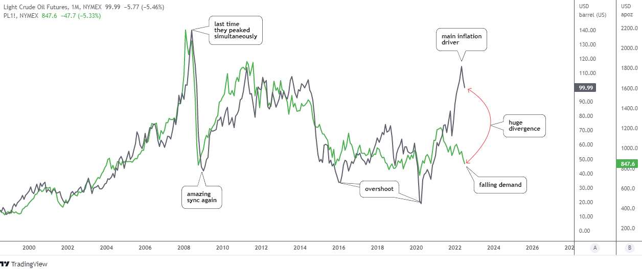
There is a quarter of a century of amazing correlation between crude oil futures (gray, scale A) and platinum futures (green, scale B) in the chart above. The rally and the simultaneous climax in 2008 with the following tremendous collapse into the same valley the same year are the bright spots of that strong sync.

These two instruments have been swapping the leading role as sometimes oil has been showing the path to the platinum and vice versa. The strong rebound in the past financial crisis in 2009, as well as the robust recovery in 2020 has been led by platinum futures.

The long-lasting depreciation period from 2011 till 2020 has several mis-correlation spots and overshoots in the oil price. In 2020, the two instruments have synced again as the platinum price appreciated strongly to levels unseen since 2014 and crude oil was catching up.

Last year something went wrong as the price of the metal could not progress higher after hitting the 6-year top of $1,348 in February 2021. In spite of this, the link remained strong for some time longer.

The oil price has paused its rally making the sharp zigzag in the area of the platinum price peak as if it was “inviting” the metal to continue hand in hand sky high, but in vain. This is when the divergence has started to grow and reached the ultimate gap this year.

What’s next? Possibilities that come to my mind would be a huge drop in oil price down to the $50 area to match with the current platinum level, the strong recovery of the metal’s price to around $1,600 to catch up with the oil price, or the third path would be a compromise, both instruments close the gap equally to meet in between around $75 for crude oil futures and $1,200 for platinum futures.

Every news feed tells us why oil is rising daily. What about the platinum depreciation? Let's check its fundamentals.
Platinum Supply and Demand

Source: Metals Focus, World Platinum Investment Council

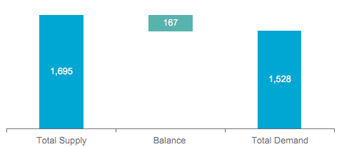
In the first quarter of this year, the platinum market is in the oversupply of 167 thousand oz. Both parts of equilibrium are down, but demand dropped harder.

Platinum Demand

Source: Metals Focus, World Platinum Investment Council

Three of four main components of platinum demand have decreased, especially industrial and investment components. The automotive demand remains flat. Total demand declined 26% (-541 thousand oz.) year-on-year, which is huge and it doesn’t support the metal’s rally.

Let us check the price chart of platinum futures.
Platinum Futures Monthly

Source: TradingView

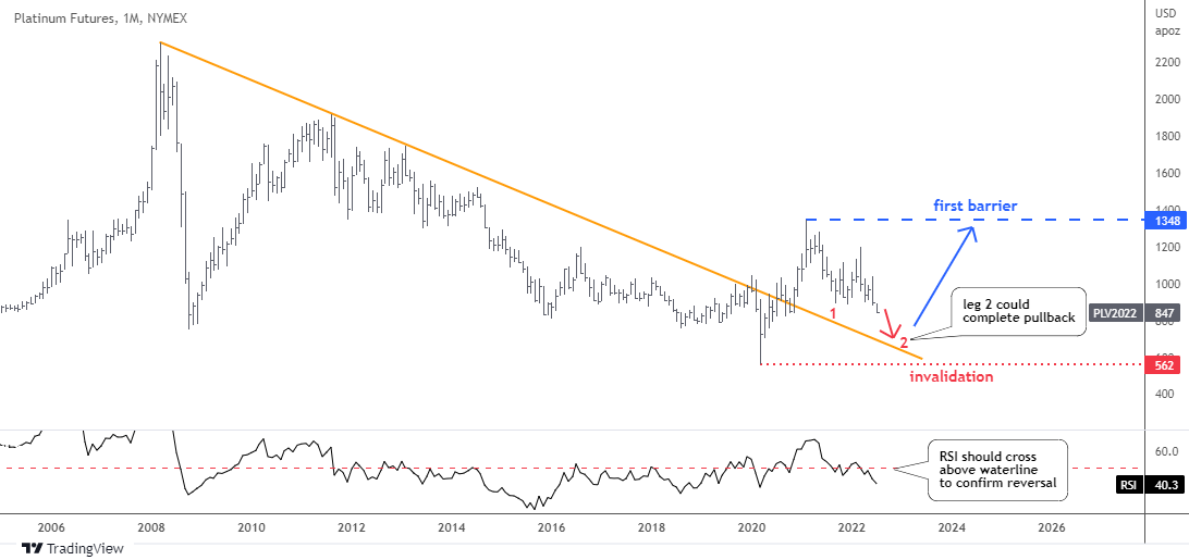
The price of platinum futures moves downwards in the second red leg within a large pullback to retest the broken resistance.

The retracement was already deep enough as it dropped below the 61.8% Fibonacci retracement level. The next support level is located at $730 (78.6% Fib). The touch point of retest is located even lower around $670. Though, the market price has more room for a further weakness.

The price shouldn’t fall below the invalidation level of $562 where the current growth point is located. The first upside barrier is too far now at $1,348 (2021 peak).

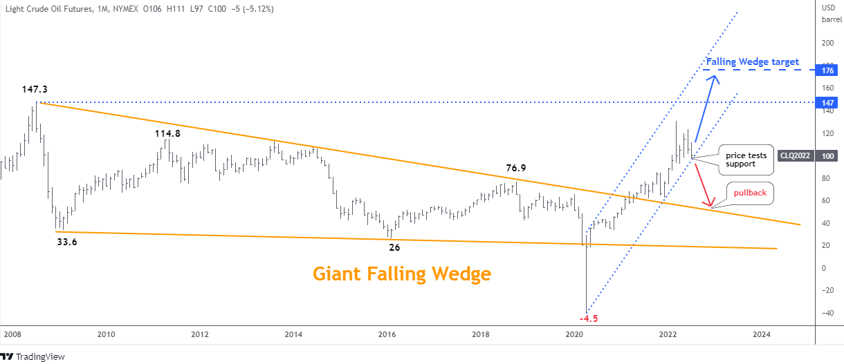
This April I called the oil price to skyrocket to $176. These days, it is not a bold projection anymore as “Global oil prices could reach a “stratospheric” $380 a barrel if US and European penalties prompt Russia to inflict retaliatory crude-output cuts”, JPMorgan Chase & Co. analysts warned.

The updated oil futures chart is below.
Oil Futures Chart

Source: TradingView

The oil price has advanced almost $30 since April, however the previous top of $130 was not touched. There is a retest of the blue uptrend channel support now and the situation could change anytime soon.

The bounce back in the uptrend could fuel the price to retest the all-time high of $147 at least. On the other hand, the breakdown could send the price into a deep pullback to the broken orange resistance around $50.

The latter is the price area where crude oil would close the gap to catch up with platinum according to the first chart above. It is an amazing coincidence of different charts.

How do you think the current divergence between crude oil and platinum will play out?

View Results

Loading ... Loading ...

High energy prices are the main driver of the current persistent inflation. Platinum is an industrial precious metal and its depreciation reflects the falling demand affected by gloomy projections of the economy and the tightening Fed. This combination could result in the stagflation (stagnation + inflation) of the economy.

Intelligent trades!

Aibek Burabayev
INO.com Contributor

Disclosure: This contributor has no positions in any stocks mentioned in this article. This article is the opinion of the contributor themselves. The above is a matter of opinion provided for general information purposes only and is not intended as investment advice. This contributor is not receiving compensation (other than from INO.com) for their opinion.

Copper Fears Recession

The copper futures hit an all-time high this spring. This is not a surprise to many readers who suspected it would - see the poll from late August.

The price has topped at $5.04, missing the preset target area between $5.36-$5.41. After that, copper futures collapsed below the valley of the last summer ($3.96) in the area of $3.60.

See the latest stats for the copper market in the table below.

World Refined Copper Usage and Supply Trends

Source: The International Copper Study Group (ICSG)

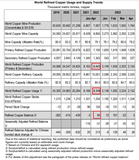
According to the table above, the world refined copper production has increased to 8.44 million metric tons in the first four months this year, compared to 8.16 million metric tons for the same period last year.

At the same time, the world usage or demand has grown up either to 8.35 million metric tons in January-April this year from 8.17 million metric tons last year.

As a result, this year the copper balance turned into a surplus of 95 thousand metric tons compared to a deficit of 3 thousand metric tons last year. Moreover, if we take the last line of the table that shows the refined balance of the market adjusted for the Chinese bonded stock change is in even bigger oversupply of 213 thousand metric tons.

As we can see, the market fundamentals could have undermined the uptrend in the copper price in the first place. The following speed up of the futures collapse was fueled by the hawkish Fed, Chinese lockdowns and a new scaring mantra that has been circulating recently in the media about upcoming recession.

One could call it a self-fulfilling prophecy as last Friday the Atlanta Fed posted a second quarterly decline of a real GDP in a row on its GDPNow tracker. The second quarter reading is minus 2.1%, the first quarter reading was minus 1.6%. Technically speaking, this could mean that the forecasted recession is already here.

The auxiliary economic data from the graphs below also confirms the economic headwinds for the copper market.

US PMI vs Copper

Source: tradingeconomics.com

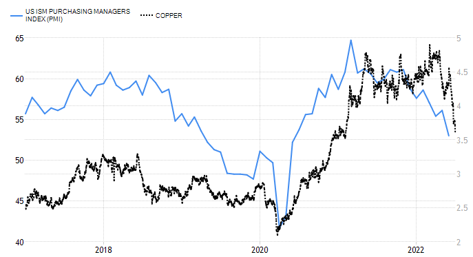
United States ISM Purchasing Managers Index (PMI) (blue) fell to 53 in June of 2022 from 56.1 in May, demonstrating the slowest growth in factory activity since June of 2020, and below market forecasts of 54.9.

The robust uptrend of copper futures (black) in 2020 was in an accord with U.S. PMI until the start of 2021 where the factory activity has peaked and then started to collapse. The copper price firstly continued further up on the market inertia and then dropped huge to finally catch up with the current fundamentals.

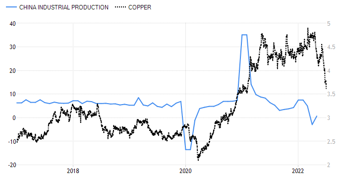
China Industrial Production vs Copper

Source: tradingeconomics.com

The similar situation has been seen in the chart above of Chinese industrial production (blue). The “World’s factory” performance has also peaked last year, ahead of the top in copper futures (black).

We could see here that the metal has more room to the downside into the $3 area to reach the corresponding level of Chinese data. It is worth to note that the industrial production in China has grown up by 0.7% recently after a relaxation in COVID-19 curbs in some major Chinese cities.

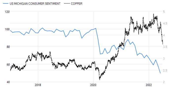
US Consumer Sentiment vs Copper

Source: tradingeconomics.com

To complete the picture, we should look at the chart above that shows the U.S. consumer confidence (blue) as a main indicator of the initial demand.

The situation is even more depressed here as we can see no progress since the pandemic outbreak. The indicator just made a small rebound within the consolidation in 2020 and then continued to the downside to hit the record low of 50.0 in June 2022.

Let’s look at the updated chart of copper futures below.

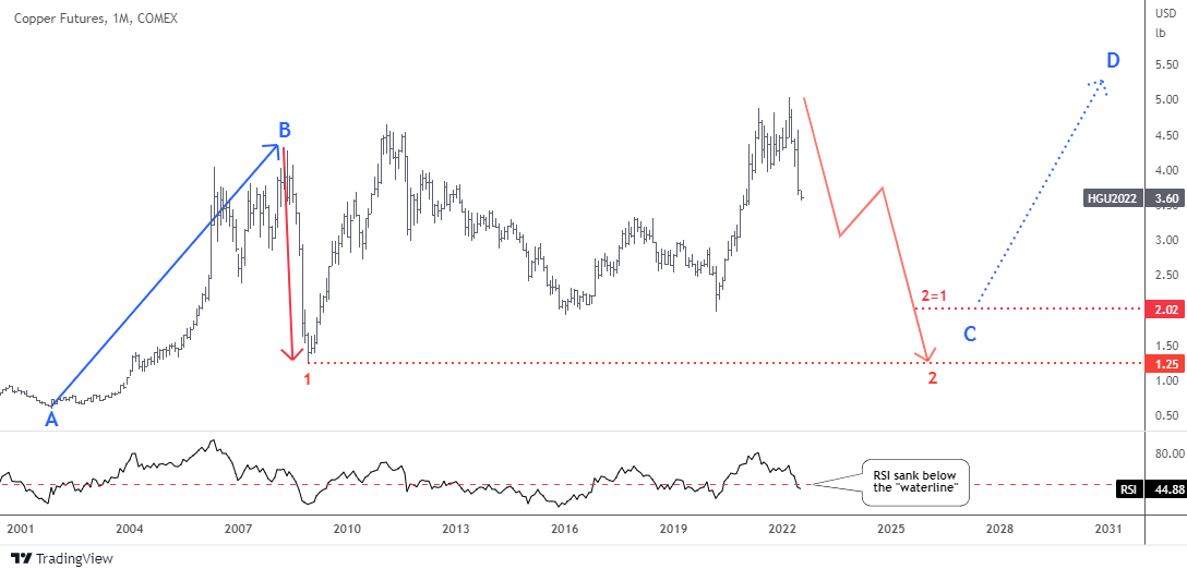
Copper Futures Monthly

Source: TradingView

The copper futures price goes well with the plan posted almost a year ago. It didn’t advance too much to the upside to fit with the extended consolidation pattern. We entered the red leg 2 down.

The latter could unfold either like the first straight leg down with a panic selling amid financial crisis of 2008 or it could build a zigzag with a corrective phase in the middle of the drop. More often than not, two legs are not alike.

Two possible downward targets could be set. The closest one is computed using the distance of the first red leg down subtracted from the new all-time high; it is aimed at $2.02. This area coincides with the valley of 2016 and 2020.

The next target is an old one as it Is located at the minimum of the first red leg down at $1.25.

The RSI sank below the so-called “waterline” beneath the crucial 50 level. If it closes this month there than the bearish trend is confirmed.

How deep could the copper futures collapse?

View Results

Loading ... Loading ...

Intelligent trades!

Aibek Burabayev
INO.com Contributor

Disclosure: This contributor has no positions in any stocks mentioned in this article. This article is the opinion of the contributor themselves. The above is a matter of opinion provided for general information purposes only and is not intended as investment advice. This contributor is not receiving compensation (other than from INO.com) for their opinion.
Gold Bugs Better Not Look At These Charts

Last week the Fed has lifted its benchmark interest rate aggressively by 0.75 percentage points and that was the biggest increase since 1994. This decision came with the yearly inflation of 8.6% in May running at its fastest pace since December 1981.

Moreover, new hikes are to come this year as the Fed’s benchmark rate is targeted at 3.4% by the end of this year, according to individual FOMC members’ expectations. This factor puts downward pressure on asset prices across the market. Bonds are definitely on that list.

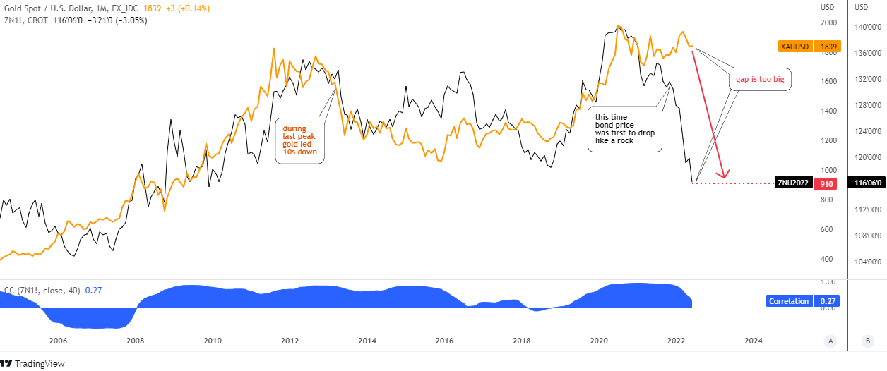
I found an alarming correlation between gold and 10-year U.S. government bonds (10b) that appears these days in the chart below.

Gold VS US 10Y Bonds Monthly

Source: TradingView

The gold price (orange) and the 10b price (futures, black) have a similar trajectory over the considered period since 2006. The blue sub-chart with the indicator of correlation confirms the strong link between these two trading instruments.

The price line of gold looks smooth compared to a volatile 10b line. The major peaks match with each other both during the previous peak in 2011 and the most recent top.

However, the area between peaks does not show the perfect correlation as the gold price continued to the downside from the earlier top while the 10b reversed to the upside in 2014. The top metal had led the drop that time.

This time, we see a strong divergence between assets. The 10b was first to drop like a rock as the inflation spiral only grows. The gap is already too big as the gold price stubbornly keeps under the all-time high. Time is ticking away for the yellow metal which should show a breakup of the major top to keep bullish, otherwise… just look where 10b is now.

The bond price has hit a low of around $114 this month, the level unseen since June 2009. At that time, the gold price had hit the low of $913. I marked the current corresponding level of gold at $910 with the red dotted line. This means that the top metal could lose half of its current price to dive below the valley of 2015 at $1,046.

Do you see the correlation between gold and 10-year U.S. government bonds?

View Results

Loading ... Loading ...

Last year I had shown you the map of possible large leg 2 down to extend the correction in the wake-up call for gold. It is time to dust it off and update here.

Gold Monthly

Source: TradingView

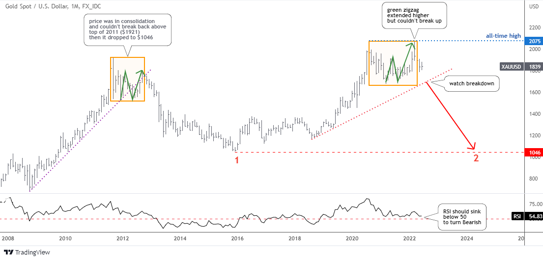
The right green zigzag inside of the right orange box extended higher than expected. However, it could not break the all-time high to repeat the pattern in the left orange box. The chance to continue to the upside is evaporating over time.

The drop below the red dotted support ($1,700) with the bearish confirmation from the RSI sinking under the 50 would open the way for the second large red leg to the downside. It could retest the 2015 low of $1,046.

In my previous gold update, I shared with you the bullish ascending triangle pattern spotted on the weekly chart.

The gold price did not progress to the upside within the pattern as it was supposed to. On the contrary, it almost fell out below the support of a triangle to challenge the validity of the pattern.

The RSI is still under the so-called “waterline” of 50. The collapse below $1,677 mark would totally invalidate the pattern.

The Fed could tighten its policy until it “breaks” the economy as there is a substantial lag between its action and the following effect on the economy. In the meantime, let us watch and see which of the gold triggers appear first – bullish or bearish.

Intelligent trades!

Aibek Burabayev
INO.com Contributor

Disclosure: This contributor has no positions in any stocks mentioned in this article. This article is the opinion of the contributor themselves. The above is a matter of opinion provided for general information purposes only and is not intended as investment advice. This contributor is not receiving compensation (other than from INO.com) for their opinion.