Golden Pattern For Silver, Not Gold

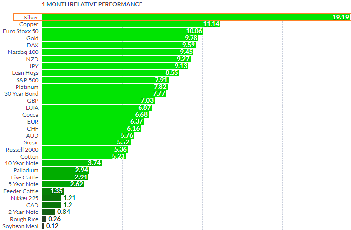
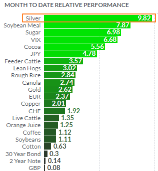
Silver futures continue to maintain leadership not only among metals, but compared to all futures as we can see in the leaderboard below.

MTD Relative Performance

Chart courtesy of finviz.com

The white metal has seen gains of close to ten percent month-to-date. None of the metals come close as copper futures, formerly the number two, has lost its shine lately as I shared the reason last week. When compared to silver futures, gold futures appear pale with gains of 2.62%.   

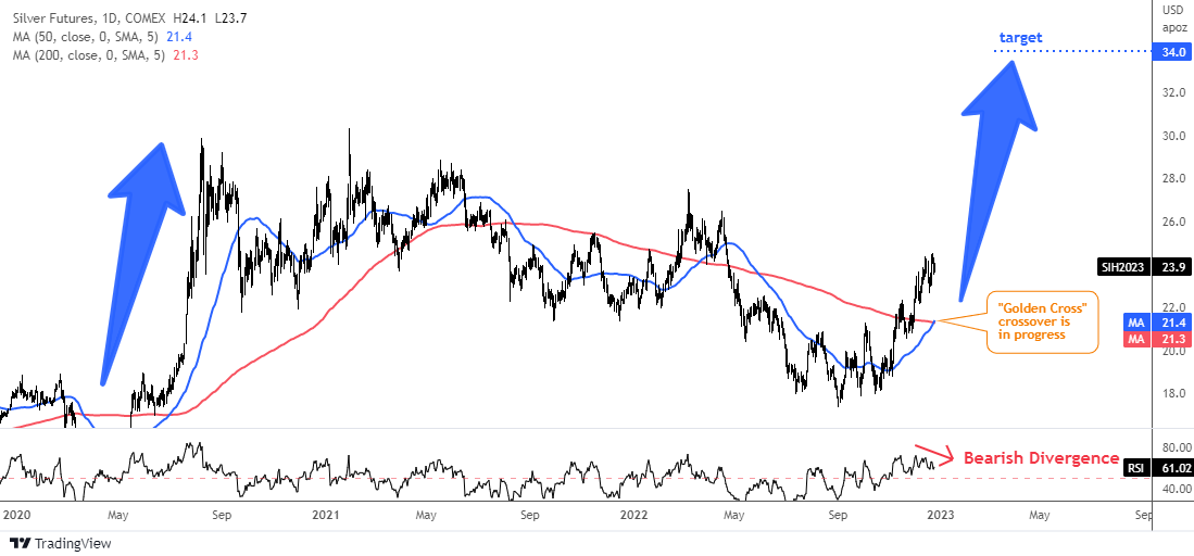
All last week, I observed a pattern in the making, watching to see when it would trigger. As a result, exactly at the end of last week, the expected event happened. Here is a visual representation in the daily chart below.
Silver Futures Daily Golden Cross

Source: TradingView

There are two simple moving averages in the silver daily chart above. The blue line represents a 50-day moving average and the red one is a 200-day moving average. We can see that last week the short-term blue line crossed above the long-term red line. This pattern is called a “Golden Cross”. It is a bullish sign as it indicates a change in the trend to the upside. Continue reading "Golden Pattern For Silver, Not Gold"

Fed Fears Inflation, Copper Fears Hawkish Fed

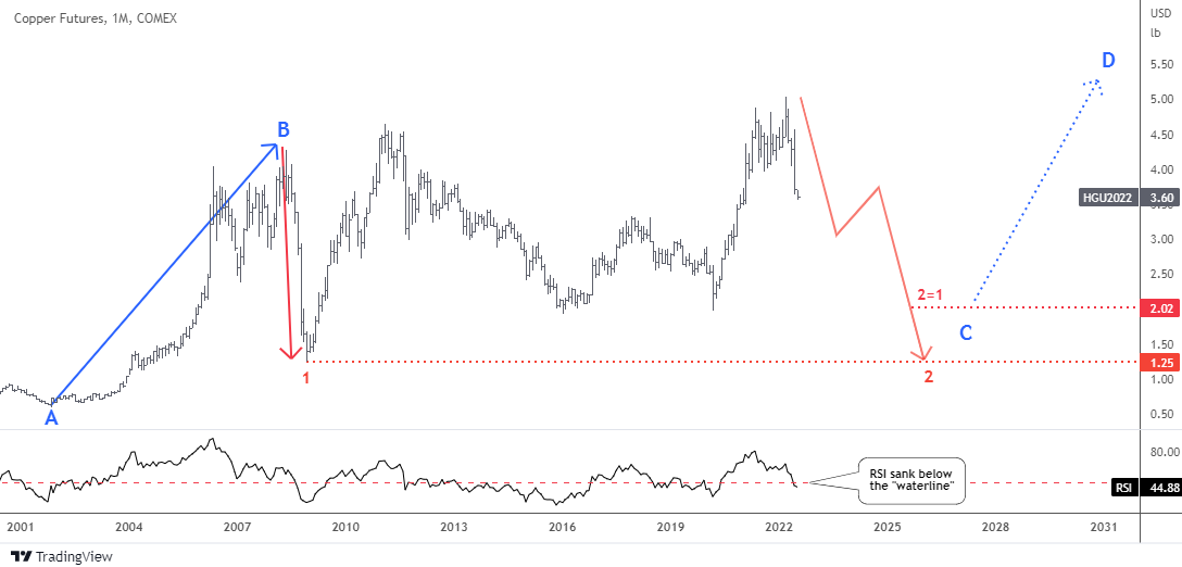
Copper futures have closely followed the trajectory of the zigzag that was outlined this summer in the post titled “Copper Fears Recession”. Below is a copy of that monthly chart to refresh your memory.

Copper Futures Monthly

Source: TradingView

The majority of readers bet that the price would remain above $3. Within the same month, the price reached a valley of $3.13 and subsequently recovered. This vote is still valid as the price hasn't crossed that handle yet.

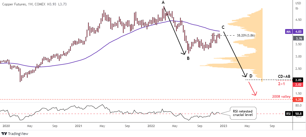
In the next weekly chart update, we will examine the outlook further.  

Copper Futures Weekly

Source: TradingView

This is a closer look at the second red leg down shown on a bigger time frame in the summer. When the first leg up within a bounce in copper futures was unfolding, it looked promising at the beginning. Continue reading "Fed Fears Inflation, Copper Fears Hawkish Fed"

USDJPY: Reversal or Setback?

Back in September, I shared with you my take on the USDJPY currency pair based on 360° view. A combination of fundamental factors and technical factors has supported the continued strength of the U.S. dollar relative to the Japanese yen.

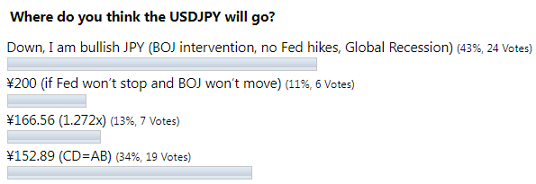
However, the majority of readers predicted the opposite, as you can see in the screenshot below.

Poll Results

As the second largest vote played out the best, the USDJPY has soared more than six percent to reach a peak of ¥151.94. The previous time this level appeared on this chart was in the summer of distant 1990, two decades ago. That move was close to hit the CD=AB target at ¥152.89, however it has lost the momentum.

The pair has lost more than it gained in that call and there is a question, is that all or are we just in a large correction?

I prepared for you another bunch of visualizations below to answer that question.

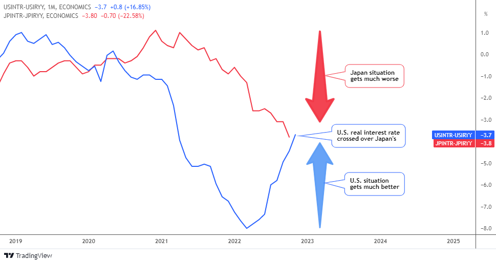
Let’s start with the fundamentals first in the interest rate comparison below.

US vs JP Real Interest Rate

Source: TradingView

Continue reading "USDJPY: Reversal or Setback?"

Poor Man's Gold Shines The Brightest

Please take a look at the graph below. These futures left their competitors far behind with a tremendous gain of almost twenty percent in only one month.

1 Month Futures Performance

Chart courtesy of finviz.com

On a one-month horizon, silver's meteoric price increase is undeniable. None of the metals can even come close. Copper is lagging eight percent behind as gold futures show only half the performance of silver. By the way, I am about to show you the relative dynamics of these top metals in the chart below.

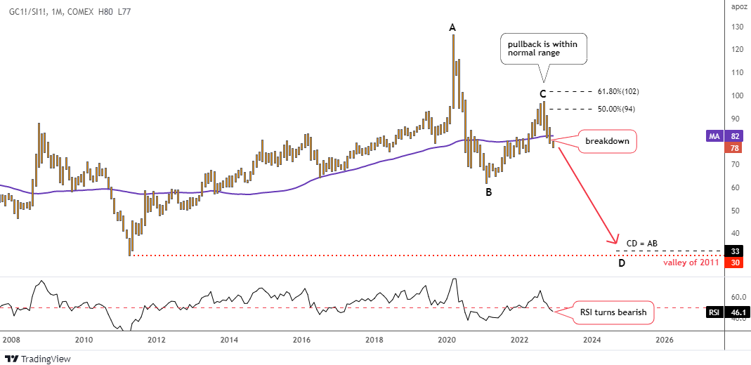
Gold-Silver Ratio

Source: TradingView

The chart above visualizes the comparative superiority of silver futures over gold futures that we revealed in the first graph. The white metal has been reversing its nine-year losses since the bottom of 2011 at 30 oz up to the all-time high at 127 oz in 2020, where the large age long cycle has been completed. Continue reading "Poor Man's Gold Shines The Brightest"

Crypto Update: This Major Coin Could Bounce

It is time to update the crypto charts as I spotted one strong alert in a major coin for you.

Let me start with the charts showing the balance of power in the crypto-sphere. The two majors will be first.

Bitcoin vs Ethereum

Source: TradingView

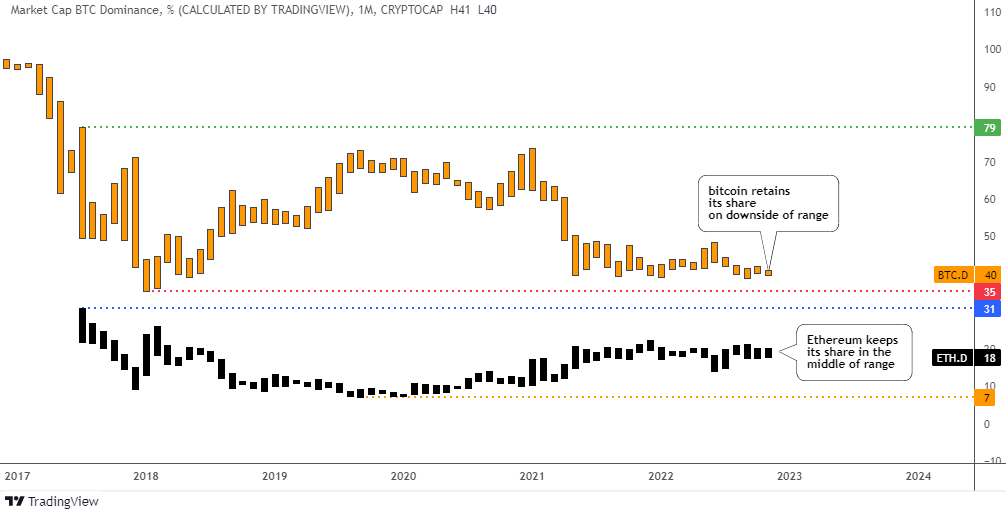
In spite of the so-called “crypto-winter” in the market, these two mastodons have kept their stranglehold on both individual and combined market share.

Bitcoin’s market share (orange bars) remains stable at 40% of the market no matter what. However, it is located on the downside of the range as other coins have taken their place in the sun. The all-time low was recorded at 35% in distant 2018.   

Ethereum’s dominance (black bars) is also solid at 18%. It saw a high market share of 31% at the beginning of its life. Currently, it is exactly in the middle of the range. It's worth noting that moving to a new proof-of-stake (PoS) mechanism didn't add power to the second largest coin so far.          

The combined market dominance is solid, hovering around 60%.

Let us move on to the rest of the top ten list excluding stable coins. Continue reading "Crypto Update: This Major Coin Could Bounce"