I appreciate active readers of the Blog for leaving valuable comments on Gold and Silver posts. Recently, there have been a lot of thoughts shared not only about the metals itself but also about its relationship reflected in the dynamics of the Gold/Silver ratio. I think it’s time to talk about it in this post. Please feel free to enrich this piece with your valuable thoughts in the comments section.
Back in December 2014, I shared only the third post here on the Blog. The title was more appropriate for a science fiction novel as it promised the “journey to the Moon” for the Gold/Silver ratio as it was going to hit the 109 ounces. Below is that very chart from the distant 2014 to refresh the memory.
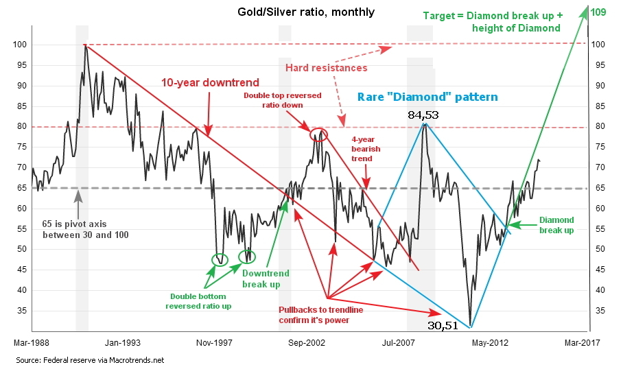
The idea was based on the “Diamond” pattern spotted on the monthly chart (blue). The target was reached more than five years later on the 16th of March this year. The total gain is equal to 109 - 72 = 37 troy ounces of silver per troy ounce of gold or 51% in five years.
Let’s see in the weekly chart below the ratio dynamics after that post. Continue reading ""Diamond" Pattern Pushed Gold To Sky Vs. Silver"

