Gold & Silver: The King Fights Back

The benchmark 10-year Treasury yield spiked to 1.61% last week for the first time in more than a year. The U.S. dollar, aka “King,” fought back to the upside on this growth of the yield. Investors ran out of other assets, including precious metals, and its price dropped.

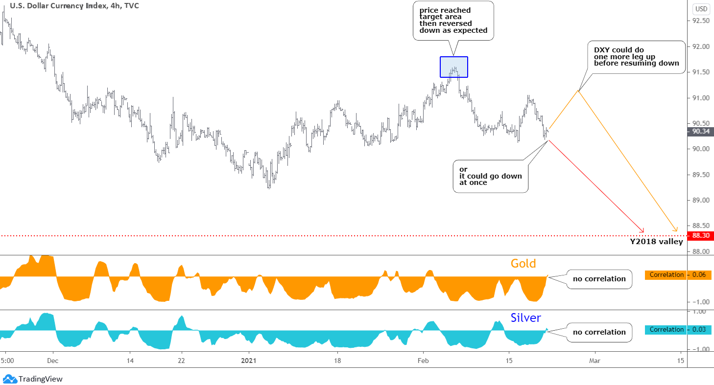
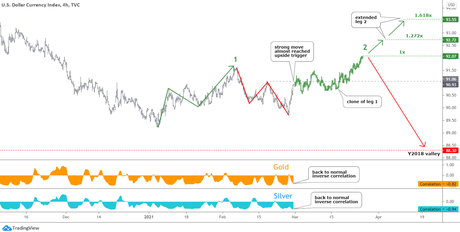
Let us see the updated structure of the U.S. dollar index (DXY) in the chart below.

dollar

It looks like the DXY moves according to your favorite orange path to the upside that was published last week. However, the sharp drop below the earlier valley eliminated both scenarios. Continue reading "Gold & Silver: The King Fights Back"

Watch Gold, Leave Silver Alone

It is time to update the charts as gold triggered the former valley of $1765 last Friday.

The U.S. dollar index (DXY) opens this post.

Dollar Index

Most of you agreed last month with the plan that the dollar index will extend its consolidation to the upside, making a zigzag first to the downside and then to the upside with the target area between 91.40 and 91.80 (blue box). The former was your favorite goal, and it was hit with a margin as the price reached 91.60 at the top of this month. Continue reading "Watch Gold, Leave Silver Alone"

Is Platinum A Runaway Train?

It looks like my post titled "Platinum Could Rocket To $1912" published in November 2019 could turn prophetic as the price of platinum price is moving quickly in the direction of the called target. The majority of readers supported this idea at that time, although with a small margin.

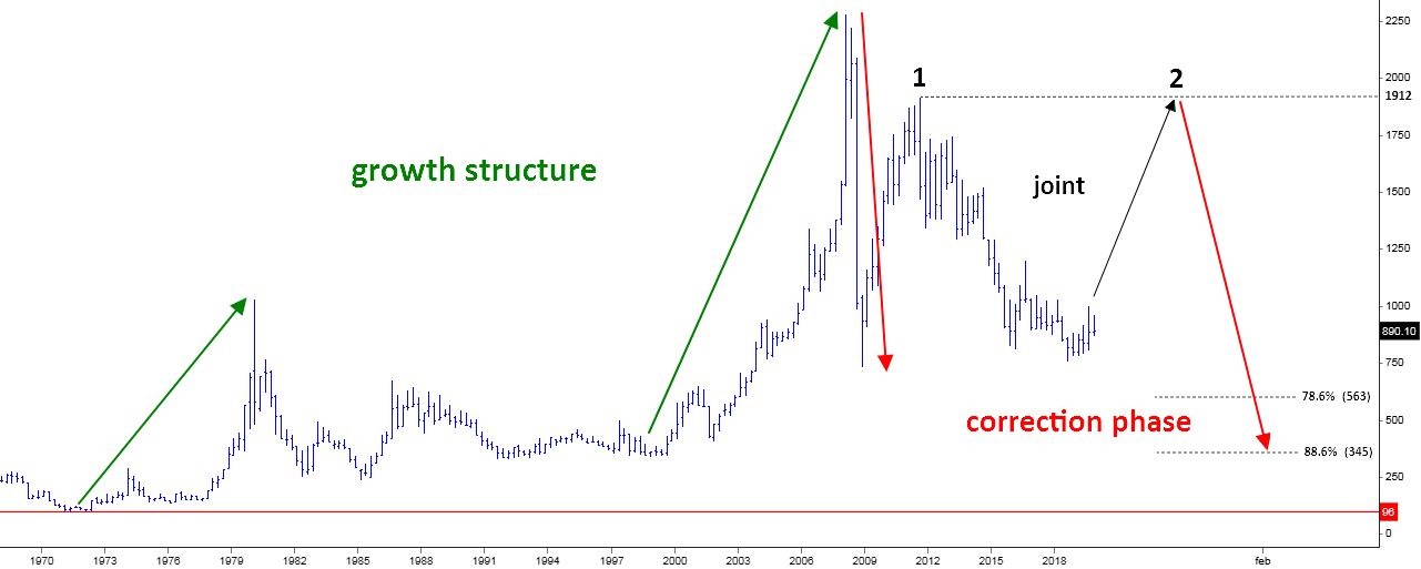
Below is that very chart where I shared the global structure for the large complex correction in the platinum market.

Platinum
Chart courtesy of stooq.com

To remind you, the idea was that leg 2 to the upside (black up arrow) should complete the "joint" between large red legs to the downside. It was thought to retest the top of leg 1 above $1900. The price was at $890 then. Continue reading "Is Platinum A Runaway Train?"

Can You Imagine Bitcoin At $103,000?

Some investors believe that the price of Bitcoin could hit $100k. In this post, I'll share some measurements I made in the bitcoin chart to see if there is some evidence for such strong optimism.

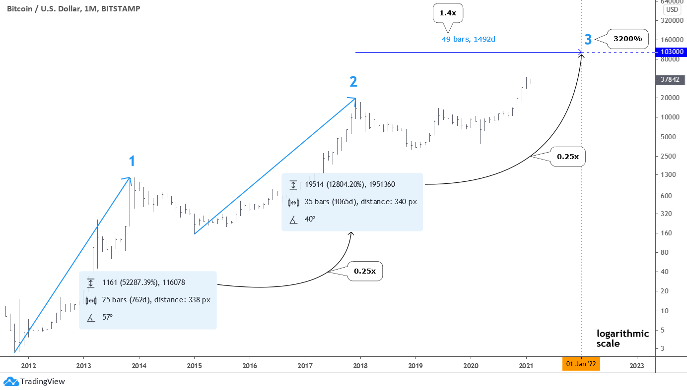
There is a logarithmic (log) monthly chart of bitcoin below. I chose the log scale to show you the coin's relative performance. It will reveal the different angle of view on the price dynamics for you.

Monthly Bitcoin Chart

We can highlight two completed large moves to the upside marked with numbers accordingly. On the right side of each move, there are light blue statistics windows showing how much, how long, and how sharp the move was. Continue reading "Can You Imagine Bitcoin At $103,000?"

The Rebels From Reddit Favor Silver

The internet is still one of the most revolutionary things invented. The new level of communication and coordination it gives us is just amazing. Hedge funds could not imagine a sudden coordinated attack that started as a post on Reddit could impact them so hard. The next market in their crosshairs? Silver!

The GameStop frenzy just let the dogs out. Lately, the retail investors from the famous Reddit chat Wallstreetbets started looking towards the iShares Silver Trust ETF (SLV) as they are looking forward to profiting from the same strategy of short squeeze earlier mastered on GameStop shares. They chose SLV ETF because its shares are backed with physical silver.

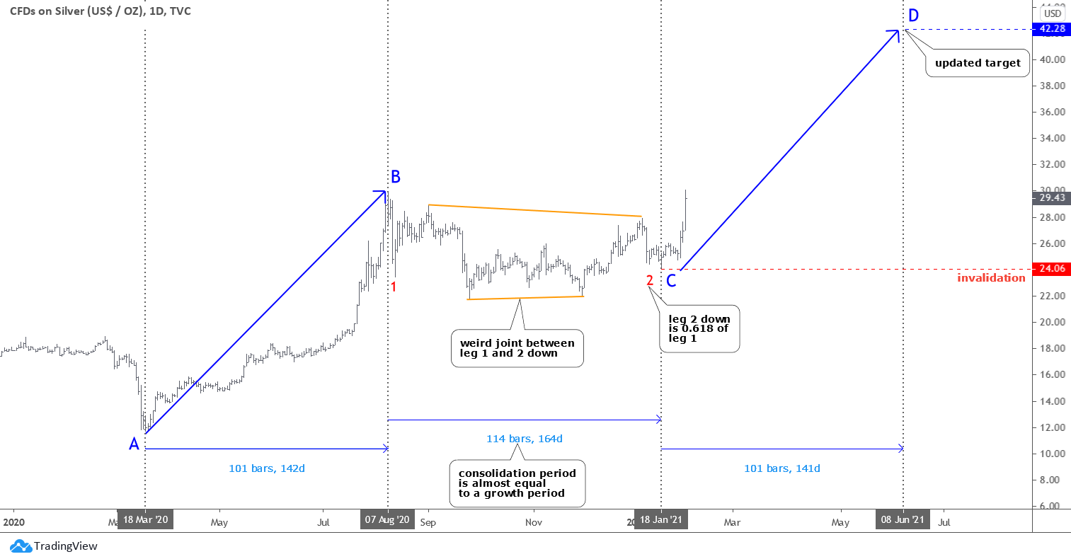
I prepared two silver charts to show you how the retail market force changed the structure and its outcomes.

Silver

There is an optimistic scenario depicted in the chart above. It implies the completion of the entire corrective structure. The red leg 2 down is considered to be done as it traveled only 0.618 of the red leg 1 distance. As you may remember, it is the Fibonacci ratio. The joint between legs 1 and 2 looks weird but is yet possible. Continue reading "The Rebels From Reddit Favor Silver"