Natural Gas: Opportunity of the Year?

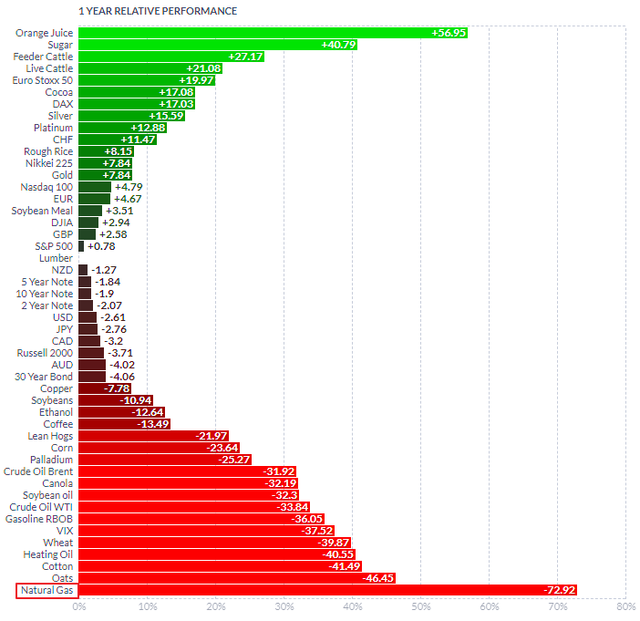
It's difficult to imagine that this energy commodity could offer a promising opportunity for profit when you observe its performance across different timeframes, including yearly, half-yearly, and even year-to-date. Below is a chart displaying its performance over the course of one year.

NG Futures 1Y Performance

Source: finviz.com

Natural gas futures have performed the worst among all commodities on the mentioned timeframes, losing 73% of their price in one year. They are almost double the percentage loss of the next worst-performing commodity, oats futures.

The chart below sheds light on the poor performance of natural gas futures. Continue reading "Natural Gas: Opportunity of the Year?"

Silver Update: Roller Coaster Ride

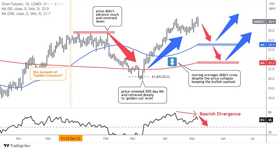
The previous post “Golden Pattern For Silver, Not Gold” from December highlighted a bullish pattern called the 'Golden Cross' that appeared on the daily chart of silver futures. This occurred when the 50-day moving average crossed over the 200-day moving average.

While the majority of readers considered this signal to be reliable, they did not expect the price of the metal to rise above $30.

The following daily chart will show how the pattern has played out since then.

Silver Futures Daily

Source: TradingView

When the ‘Golden Cross’ signal was posted, the price of silver futures was at $23.9 (marked by the orange vertical line), and it went up almost $1 to reach $24.8 before stalling for over a month.

The price was unable to break above this new high and subsequently collapsed, dropping below the blue 50-day MA and testing the red line of the 200-day MA, briefly breaking through to reach the ‘golden cut’ Fibonacci retracement level of 61.8% at around $20. Continue reading "Silver Update: Roller Coaster Ride"

"Dr. Copper's" Prescription Proves Effective

In February, I presented my analysis of copper and gold/copper price trends in a post titled, Dr. Copper Prescribes Gold. Now, it's time to update both charts.

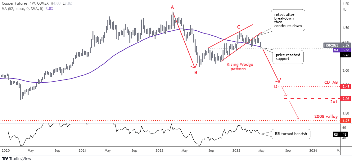
In the previous analysis, most readers preferred a conservative outlook for copper futures prices, predicting a drop to only the equal distance in the CD part, which is $2.45. Since then, the price has declined, but not as rapidly as anticipated.

Let me show you the updated copper futures chart below.

Copper Futures Weekly

Source: TradingView

As expected, the price action on the Rising Wedge pattern's support played out in textbook fashion, with the price breaking below it and then spiking up to retest it before continuing its downward trend.

The price has now reached a double support zone formed by the purple moving average and the black horizontal trendline, between the $3.78 and $3.83 levels. Continue reading ""Dr. Copper's" Prescription Proves Effective"

Gold Update: Hard Top or Glass Ceiling?

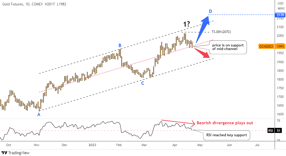
Gold price came very close to hitting the double barrier at $2,070-$2,100 of the black path target and the upper boundary of the bullish trend channel outlined earlier this month. The new 1-year top has been established at $2,063.

You were amazingly accurate this time as most of the votes were for the black path to lead the way. The market has since reversed to the downside, raising the question of whether it was a hard top or a glass ceiling.

To answer this question, let me show you an updated chart below.

Gold Futures Daily

Source: TradingView

The price has slid down to the pink mid-channel support within the black bullish trend channel.

In the RSI sub-chart, we can clearly spot a bearish divergence as the falling peaks didn't confirm the new top in the price chart. This has been playing out, pushing the price down. The indicator's reading has reached the key support of 50, just like the price. Continue reading "Gold Update: Hard Top or Glass Ceiling?"

Is The Dollar Headed Into The Abyss?

Back in January, I attempted to answer the question “Is Dollar's Dominance Over?”, as the dollar index (DX) had experienced significant losses.

However, we received two conflicting signals from the technical chart, which provided a bearish alert, and the interest rate differentials chart, which indicated support for the dollar.

In both polls, the majority of readers voted that the dollar's dominance was over and that it had already peaked for the dollar index.

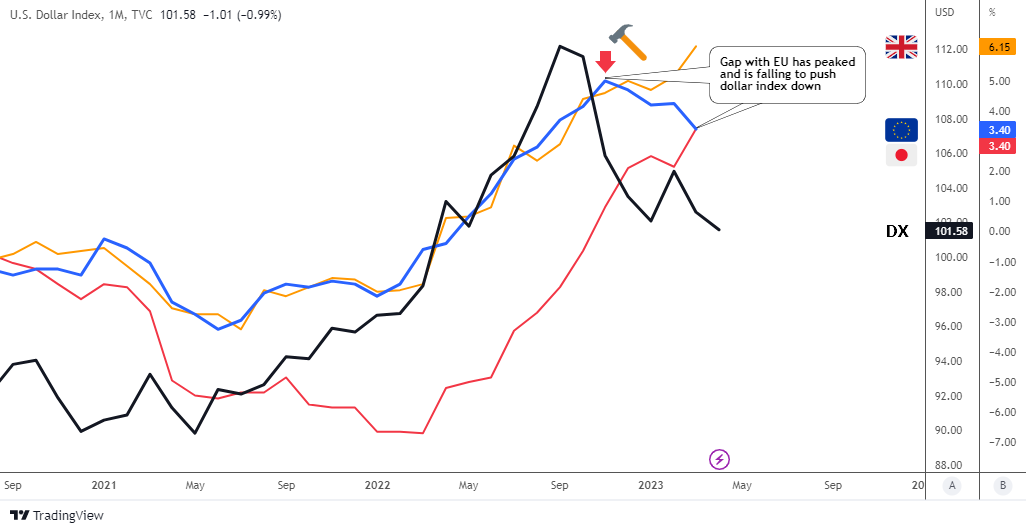
Since then, the DX has made a bounce close to $106 with the support of a hawkish Fed, however these gains proved to be unsustainable, and the price dropped back down to hit the valley established in January, reaching a new low of $100.

Is the dollar headed right into the abyss?

Let's take a look at some updated charts, starting with the interest rate differentials.

DX vs Real Interest Rates

Source: TradingView

This time, I will be using a monthly time frame to provide a closer look at what could potentially cause the dollar to decline. Continue reading "Is The Dollar Headed Into The Abyss?"